B2B Bulk plan assignment

B2B Bulk plan assignment

B2B Bulk plan assignment

Product

Holafly B2B Center

Client

Holafly

Area

User management and plan assignment

Responsibilities

UX Design / UI Design / Interaction Design / Prototyping

User management and plan assignment

UX Design / UI Design / Interaction Design / Prototyping

Platforms

Desktop and Mobile

Holafly’s B2B Center allows business administrators to manage users and assign connectivity plans to their teams. However, the existing experience made bulk plan assignment difficult to discover because the action only appeared after users interacted with the table.

The project started as a request to improve the visibility of the Assign Plans action. After reviewing the flow, I reframed the challenge as an interaction-model problem: how could we make the action easier to discover without combining filtering, selection, and assignment into one ambiguous control?

I led the exploration of the bulk-assignment flow, evaluated different interaction models, documented their trade-offs, and designed a clearer journey that separated filtering, user selection, plan selection, review, and confirmation.

Holafly’s B2B Center allowed business customers to purchase connectivity plans for their travelers. However, the existing experience combined product comparison, configuration, validation, pricing, and purchase actions inside the same cards.

The project started as a request to visually simplify the Plans page. After reviewing the experience, I reframed the challenge as a decision-flow problem: users were being asked to understand and configure several products simultaneously.

I led the design scope definition, explored multiple information architectures, documented their

trade-offs, and designed a progressive experience that separated plan comparison from configuration and checkout.

The context

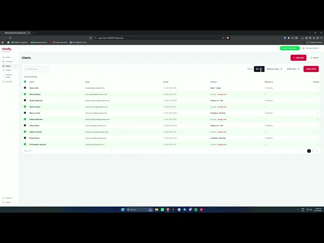
The existing experience relied on a contextual bulk action that only appeared after selecting users.

The flow required users to:

  • Identify users without an active plan

  • Select one or more users through checkboxes

  • Discover the contextual Assign Plans action

  • Choose an available plan

  • Review the affected users

  • Confirm the assignment

-Plan configuration

-Product Benefits

-Quantity selectors

-Duration selectors

-Validation states

-Pricing information

-Total cost

-Purchase CTA

Although the functionality existed, the action had low discoverability because users could not see it before interacting with the table.

Some users were unsure whether they needed to filter, select users, or open the individual Assign one action first. This increased support requests and made a common administrative task feel harder than necessary.

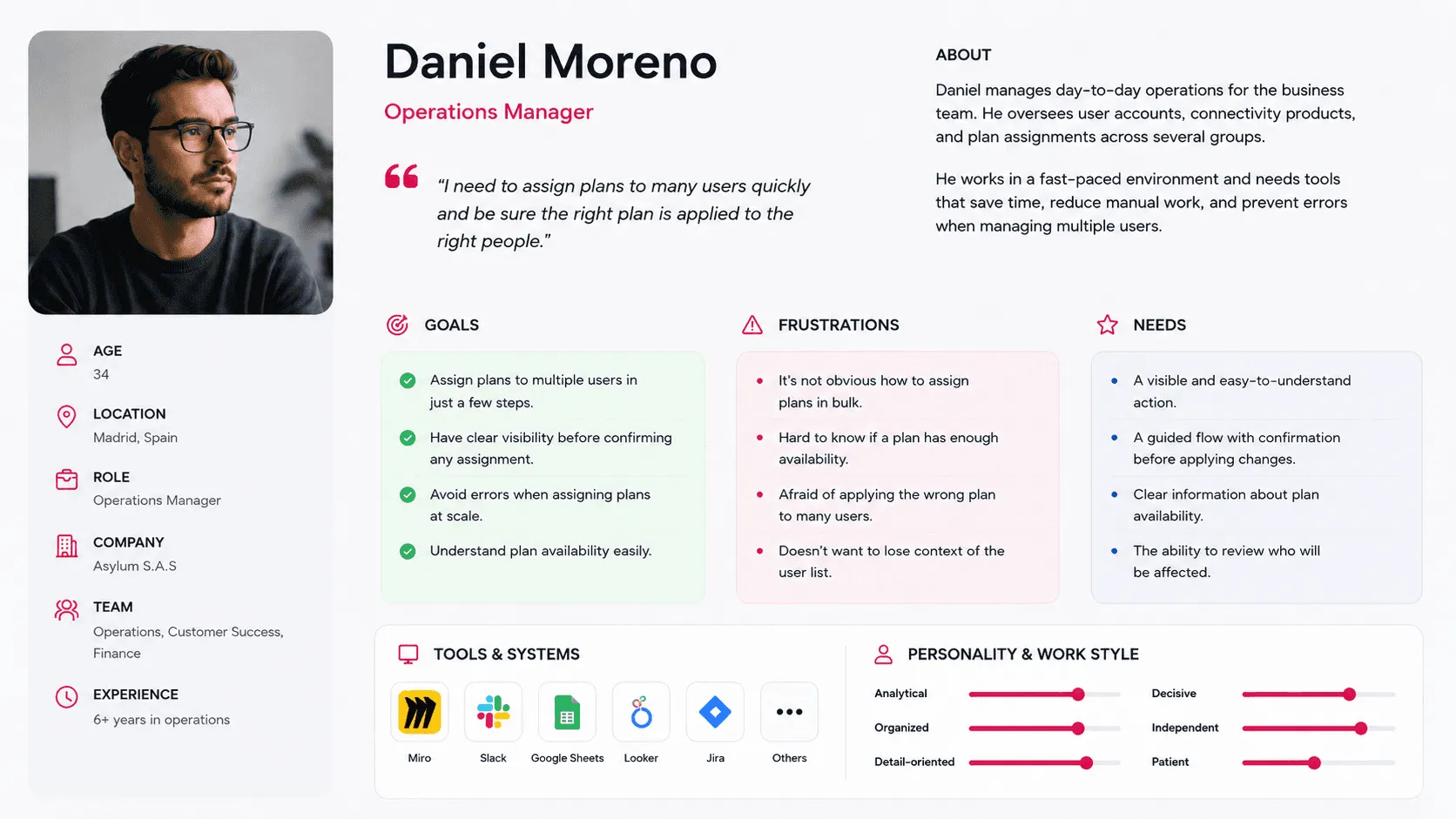
Our User

Operations managers need to assign connectivity plans to multiple users quickly and accurately.

The primary user is an operations manager responsible for managing connectivity plans across multiple teams and user accounts.


They work with large user lists, handle repetitive administrative tasks, and need to make changes that may affect many people at once. Their work requires speed, accuracy, and confidence, especially when plan availability is limited or when several groups must be managed simultaneously.

The initial request

The initial request

The original scope was described as:

The original scope was described as:

Improve the discoverability of bulk plan assignment and make it easier for administrators to understand how to assign plans to multiple users.

Before moving into UI solutions, I clarified whether the issue was primarily the visibility of the action or the interaction model behind it. The existing flow depended on users selecting rows before the bulk action appeared, which made the feature difficult to discover.

The challenge was not simply to make the button more prominent. It was to define a predictable relationship between filtering users, selecting recipients, and triggering the assignment action—without introducing conflicting behaviors or increasing the risk of accidental bulk changes.

Improve the discoverability of bulk plan assignment and make it easier for administrators to understand how to assign plans to multiple users.


Before moving into UI solutions, I clarified whether the issue was primarily the visibility of the action or the interaction model behind it. The existing flow depended on users selecting rows before the bulk action appeared, which made the feature difficult to discover.


The challenge was not simply to make the button more prominent. It was to define a predictable relationship between filtering users, selecting recipients, and triggering the assignment action—without introducing conflicting behaviors or increasing the risk of accidental bulk changes.

Scope definition

Scope definition

I proposed focusing the redesign on the following areas:

  • Discoverability of the bulk assignment action

  • Identification of users without a plan

  • Selection of eligible recipients

  • Visibility of plan availability

  • Review of affected users before confirmation

  • Feedback after completing the assignment

The project did not redefine plan pricing, inventory rules, user eligibility criteria, or the individual assignment flow. Those areas remained outside the design scope.

This distinction kept the work focused on the interaction model for bulk assignments and prevented the redesign from expanding into a broader user-management or billing initiative.

Success criteria

Success criteria

Before exploring solutions, I defined the following design success criteria.

  • Make all available plans discoverable.

  • Help users understand the main differences between plans.

  • Reduce duplicated information.

  • Avoid displaying several configuration forms simultaneously.

  • Separate product selection from product configuration.

  • Preserve the commercial visibility of the Annual plan.

  • Support plan-specific rules and fields.

  • Create a clear transition from comparison to checkout.

  • Remain scalable as the product offering grows.

Because the project did not yet have post-launch analytics, these criteria were used as design evaluation principles rather than claimed performance results.

Exploration 1

Exploration 1

Full comparison and configuration cards

The first direction displayed Daily, Monthly and Annual plans side by side. Every card contained its configuration controls, total and purchase CTA.

What worked

The first direction displayed Daily, Monthly and Annual plans side by side. Every card contained its configuration controls, total and purchase CTA.

The pricing-card format was also familiar and commercially effective.

Trade-offs

The interface still exposed several forms, totals and CTAs simultaneously.

It also made Daily, Monthly and Annual appear structurally equivalent, even though Daily required a duration while the recurring plans did not.

This direction supported comparison, but it did not sufficiently reduce cognitive load or visual noise.

Exploration 2

Exploration 2

One plan at a time

The second direction introduced tabs for Daily, Monthly and Yearly. Only the selected plan and its form were visible.

What worked

This created a much cleaner and more focused configuration experience.

It also scaled better to smaller screens and allowed each plan to use a different form structure.

Trade-offs

Users could no longer compare all options directly. They needed to switch tabs to understand each plan.

The Annual value proposition also became easier to overlook because the full plan information was hidden until the user selected its tab.

This direction improved focus but weakened comparison and commercial visibility.

Exploration 3

Exploration 3

One-time use and recurrent subscriptions

The third direction grouped plans according to their product behavior:

One-time use

Recurrent subscription

What worked

This direction represented the product model more accurately.

It separated Daily from subscription products and allowed each category to have its own interaction model.

It also reduced cognitive load by helping users begin with a broader need rather than a billing period.

Trade-offs

The additional level of navigation reduced direct comparison.

It also assumed users already understood the difference between one-time use and recurring subscriptions.

Annual was less visible, which weakened the opportunity to communicate its value.

Portotype

Portotype

The explorations showed that neither full comparison nor isolated configuration was sufficient on its own.

The strongest experience needed to:

  • Keep all products visible during discovery.

  • Remove configuration controls from the comparison stage.

  • Communicate shared benefits only once.

  • Reveal plan-specific configuration after selection.

  • Keep users in context while they completed the purchase.

This led to a progressive model:

Explore → Compare → Select → Configure → Checkout

Final solution

Final solution

  1. Plan discovery and comparison

The main page presents Daily, Monthly, Annual and Always On in simplified cards.

Each card focuses only on the information needed to understand and select the product:

  • Plan name

  • Pricing model

  • Equivalent price when relevant

  • Plan-specific benefits

  • Commercial label

  • Selection CTA

The configuration controls, total and validation messages were removed from this stage.

This significantly reduced the density of each card and made the differences between plans easier to scan.

Final solution

Final solution

  1. Plan configuration

After selecting a plan, a side sheet opens with the relevant configuration.

The side sheet includes:

  • Selected plan

  • Billing information

  • Quantity selector

  • Plan-specific configuration

  • Purchase summary

  • Total

  • Checkout CTA

This allows users to focus on one product at a time without losing the context of the comparison page.

The side sheet also provides a flexible container for plans with different configuration requirements.

Final solution

Final solution

  1. Reducing duplicated information

In the previous design, common benefits were repeated inside every plan card.

In the final solution, shared benefits were moved into a dedicated section below the plans.

This helped clarify two different types of information:

  • Plan differentiation

  • Shared value

  • What customers receive with Holafly plans in general.

  • What makes Daily, Monthly, Annual or Always On distinct.

  • This change reduced repetition while preserving access to important product information.

Final solution

Final solution

  1. Supporting commercial hierarchy

The Annual plan remained visible alongside the other options and received a clear “Best value” label.

The design also included equivalent daily pricing for Monthly and Annual, helping users compare value across billing models.

This preserved the upselling opportunity without requiring Annual to dominate the entire page.

Final solution

Final solution

Why the final direction was selected

The final direction created the strongest balance between comparison and focus.

It preserved direct visibility of all plans while removing the main source of visual noise: multiple active forms and purchase actions.

It also better supported the product model because each plan could use its own configuration after selection.

The solution was selected because it:

  • Supported direct plan comparison.

  • Reduced duplicated content.

  • Separated selection from configuration.

  • Preserved Annual’s commercial visibility.

  • Supported products with different behaviors.

  • Created a clearer path into checkout.

  • Provided a more scalable structure for future plans.

Video showcase

See a full walktrough of this case

Let’s talk.

Have a project, product challenge, or new opportunity in mind? I’m always open to connecting.

Let’s talk.

Have a project, product challenge, or new opportunity in mind? I’m always open to connecting.

Let’s talk.

Have a project, product challenge, or new opportunity in mind? I’m always open to connecting.